This revealing investment research tool is now available for free
The Index Matrix vividly illustrates how different assets performed in the past. Here’s how Canadians can use it to improve their portfolios.
Advertisement
The Index Matrix vividly illustrates how different assets performed in the past. Here’s how Canadians can use it to improve their portfolios.

Is there a fun and engaging web tool I can use with people so they can get a good grasp of expected long-term returns for equities and bonds, before and after inflation?
—Allan, Barrie, Ont.
You caught me, that is my question and not a question from a MoneySense reader. But there is such an tool. Until last week I paid about $400 a year for access, but now it is free to everyone, and I want to make you aware of it. It is so good, it is worth bookmarking.
What I like about it is it gives you a quick history of stock and bond returns. I find looking back at history gives me more confidence in what to expect in the future, especially when markets drop. Also, having a better understanding of historical returns may help you with your investment allocation decisions, possibly leading to higher expected returns.
Okay, here it is, the link to the Index Matrix. When you open it up you will see a graph like the one below.
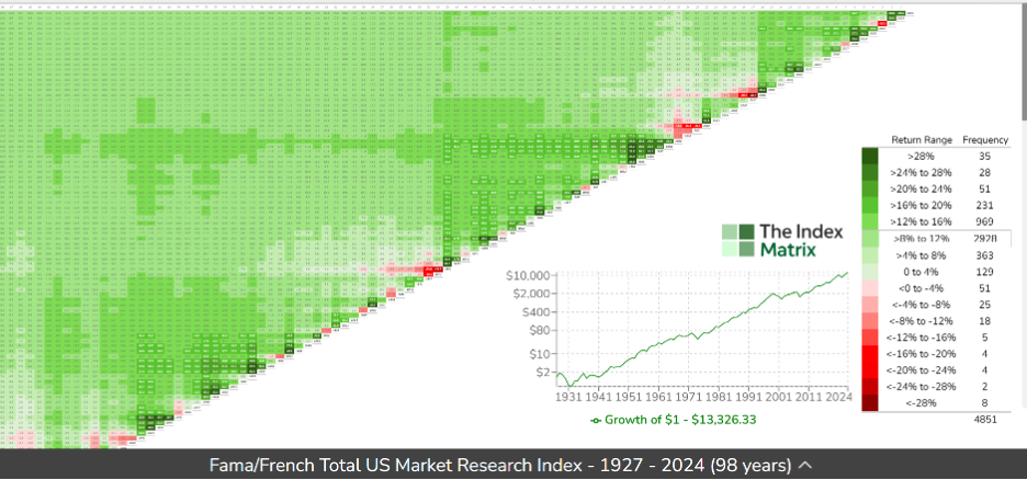
What stands out when you look at the graph? There is lots of green and bits of red. This is a graph of the S&P 500, the leading U.S. stock market index, showing the return for each year, before inflation, from 1927 to 2024. Green represents positive years and red, negative years. The deeper the shade, the higher or lower the return.
The numbers along the diagonal represent the entry year into the market. Some years are negative (red) and most are positive (green). If you look along the diagonal for a red square and then look straight up, north, until the squares turn green, that is how many years it took before receiving a positive annual return. Think of the diagonal as the barbed wire of investing. Once you get over it, your original investment is in the green pastures of positive returns.
With the page open, move your curser to the red square at the year 2000. That year the return was -11.7%. Now slide your curser north to 2010. The average annual rate of return over that 10-year period was 1.1%. That represents 10 years of no growth in the S&P 500.
Using the dropdown menu, look at Canadian market returns. For the same period, 2000 to 2010, the average rate of return was 11.6%. U.S. small value stocks (small-cap stocks with a value tilt), below, returned 11.9% between 2000 to 2010. This is a good example of how diversification can reduce risk.
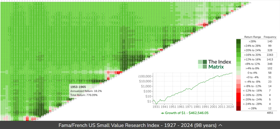
As a reader of MoneySense you may have read that, over time, small value stocks have provided higher returns than large company stocks. This is evident in the graph above with the darker shades of green that are on the S&P 500 chart. However, since 2003 the S&P 500 has outperformed the U.S. small value. Will small value get back to its historical long-term returns?
Finally, and for effect, the chart below shows bond returns after inflation. There are some shades of green, but for an asset class considered safe there are a lot of red areas—negative returns.
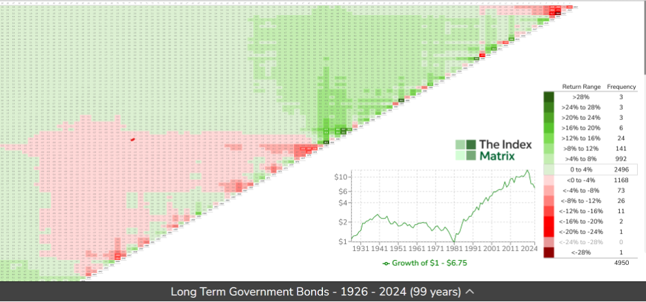
If you run your cursor up the diagonal, you will see that bonds gave equity-like returns from 1982 to 2014. You may recall, back in 1982 interest rates were high and marked the start of a long run of declining interest rates that enhanced bond returns. Bond returns weren’t like that prior to 1981. The average rate of return on bonds from 1926 to 1981—55 years—was 3% before inflation and 0% after inflation.
I have reviewed a few charts and there are many more revealing data visualizations. Open the app and have some fun playing with it yourself. The drop-down menus at the top of the tables give access to different information.
Use the lessons gleaned from historical performance to inform the design of your investment portfolio or to better understand and question the portfolio your advisor created. If you are using only equities and bonds in your portfolio, for example, what is the rationale for the bond weighting? To provide an income and or to reduce volatility?
I hope you find the Index Matrix as interesting and useful as I do.
Share this article Share on Facebook Share on Twitter Share on Linkedin Share on Reddit Share on Email

From investing too late to lacking an emergency fund, many Canadian women share similar regrets. Here’s what Gen Z...

CPP and QPP are cornerstones of retirement income for Canadians. How do you confirm what you are entitled to...

Robert has been taking RRIF withdrawals beyond the minimum required amount to gift to his kids and to reinvest...

Geopolitics, rising oil prices and ETF inflows are shaping Bitcoin’s outlook. Is now the right time for Canadian investors...

Wealthsimple's direct indexing brings a tax-saving investing strategy to a wider group of investors, but the number likely to...

It’s almost impossible to do, but the mindset around spending all your savings can help you make the best of the...

In the likelihood of a protracted conflict, these experts think people in or close to retirement need to review...

Filing your 2025 taxes in 2026? Here are the key changes, cancelled credits, and CRA updates Canadians need...

Look under the hood before buying some popular Canadian sector ETFs. There may be alternatives that better represent the...

Global conflicts affect Canadians’ finances in real time. Learn how rising costs, volatility, and uncertainty can impact your budget...
the link to the index matrix does not work. Are you able to update it please and thank you very much.
Thank you for your note. The link has been updated.
I don’t see any Canadian indexes listed in the drop-down menu. But the charts are great for US investments.